Menus - choose the next destination for your journey
Summary of features
The menu system in the COLOURcode template is constructed from simple markup and is fully automatic and responsive. It automatically opens and closes as the viewport width increases and decreases. It can be toggled between different states, and the state persists across page refreshes using browser storage.
At a glance
- Fully responsive and adapts according to desktop or tablet/phone usage.
- Choose between expanding or sliding modes for submenu levels.
- Can be controlled through a versatile javascript API.
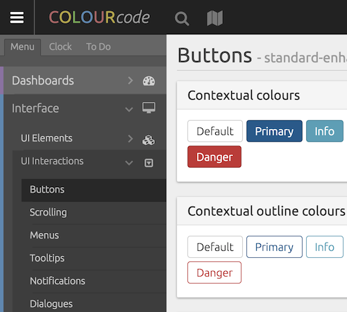
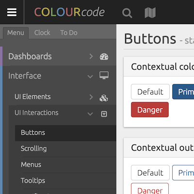
Menu visibility - desktop
When viewing on a desktop monitor, the menu can be toggled into three states: fully open, icons only, and closed.
Fully open
Icons
Closed

Menu visibility - mobile
On a tablet or smartphone, the menu is hidden (off-canvas) by default. It can be expanded by using the menu toggle button.
Closed

Open

Menu modes
The way the menu levels are navigated can be changed through the options popup (Menu Mode). This changes between 'expanding' and 'sliding'.
Expanding mode
Sliding mode
